

Outage Data & Visuals for Newsrooms
National and local outage numbers, rankings, and map-ready geometry for on-air and digital coverage.
- 96.04%US Coverage
- TopStates & Counties
- Map-ReadyGeometry
- REST / JSONFormat
The problem
Newsrooms and weather teams need credible, current outage numbers — on air and online, fast, and from a source they can cite. Manually tallying figures from utilities doesn't scale to breaking coverage. Outage Pro provides ready-to-air outage data and map-ready geometry: national and local counts, the most-affected states and counties, and the visuals to back the story — all updated continuously.
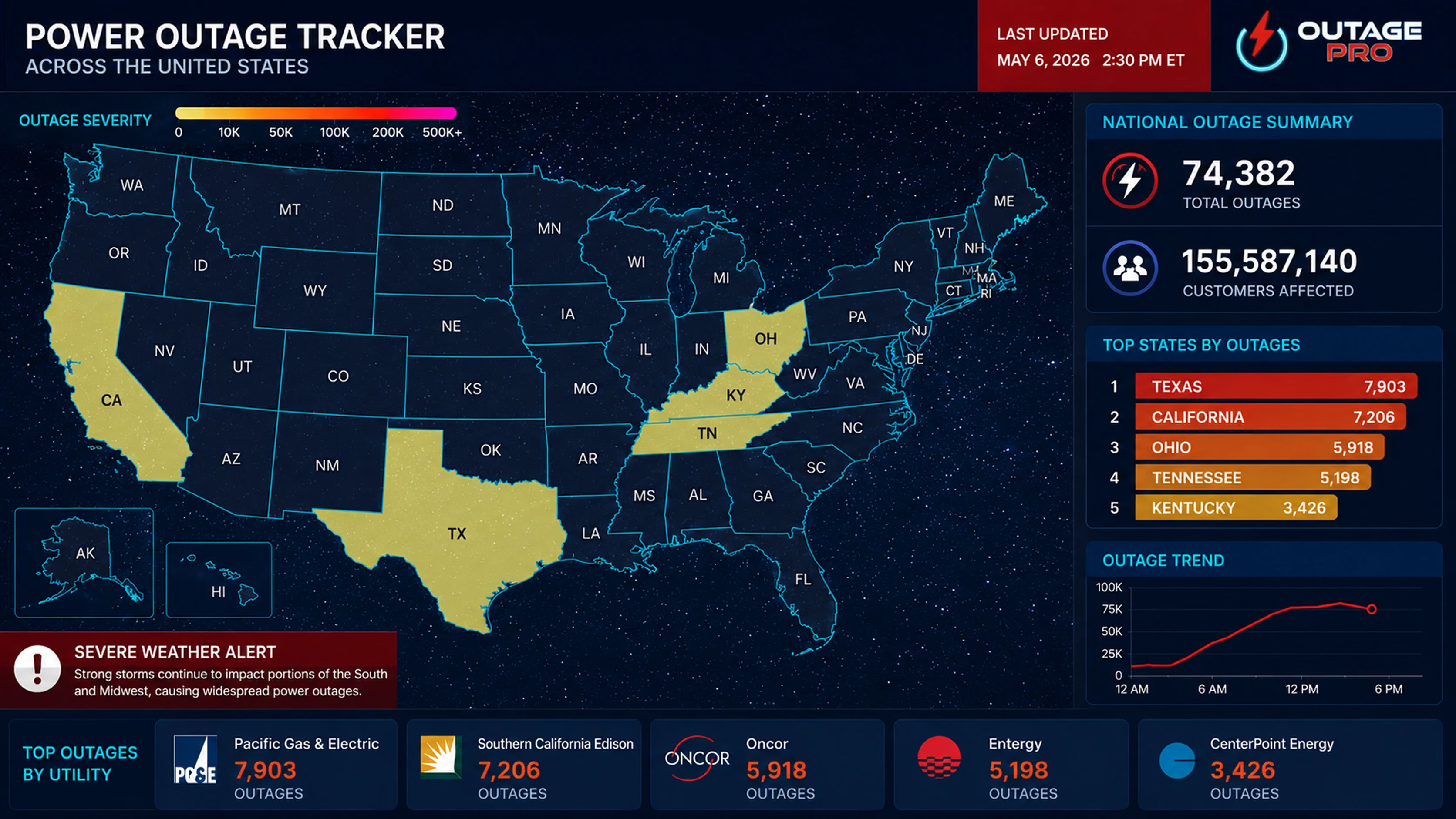
Key data points
- National total outages & customers out
- State- and county-level counts and outage %
- Top states & top counties rankings
- Full utility list
- County GeoJSON for broadcast and web maps
- Last-updated (UTC)
Key benefits

Credible, citable numbers
A consistent third-party source for on-air and digital.

Ready-to-render maps
County GeoJSON for severity maps in your graphics stack.

Instant rankings
Top states and counties pre-ranked; no client-side sorting.

Breaking-event alerts
Webhooks push the moment outages spike.

Easy to integrate
REST/JSON feeds into CMS, graphics, and dashboards.
Who it's for
 TV & Weather Teams
 News Digital Desks
Credible, citable numbers for coverage
Breaking outage coverage depends on numbers you can stand behind, on air and online. Outage Pro gives newsrooms and weather desks one consistent, third-party source instead of a tally scraped from dozens of utility pages. You get the national total outages and customers out, state- and county-level counts with the outage % for each area, and the most-affected states and counties already ranked, so there's no sorting to do before you go live. Every figure carries a last-updated time (UTC), so an anchor or producer always knows how current the number on screen is. The data comes straight from utility providers and is updated about every 10 minutes, and because it's one sourced feed, your on-air graphic and your website show the same number.
Map-ready visuals for on-air and digital
A number lands harder with a map behind it. Outage Pro provides county boundary geometry (GeoJSON) that drops into your graphics stack and your web maps, so your team can build a severity map of a storm without sourcing or cleaning boundary files first. The same geometry powers the broadcast wall and the article embed, which keeps your on-air and digital coverage looking consistent. If you'd rather not build a map at all, you can embed an interactive outage map within its documented options. As the event moves, the map and the counts update from the same feed, so producing the next hit is mostly refreshing data rather than rebuilding a graphic.
Built for breaking events
Storms don't wait for the next newscast. Instead of watching for spikes by hand, you set thresholds and let webhooks push an alert the moment outages climb in an area you cover, so the desk can react as the story develops. Through the whole event you keep the same national-to-county view: the hardest-hit states and counties ranked automatically, the full utility list behind them, and county detail for local segments. If you need to recap afterward, historical outage data is available on request.
Frequently asked questions
National power outages
- Customers Out
- 46,723
- Customers Served
- 159,700,055
- States Tracked
- 52
Top affected states
Last updated 10/18/2026 11:31 AM
- 010.22% outMassachusettscustomers out6,808
- 020.04% outTexascustomers out5,889
- 030.56% outWest Virginiacustomers out5,661
- 040.02% outCaliforniacustomers out3,204
- 050.05% outGeorgiacustomers out2,840
Ready to Cover the Story?
Talk to our team about outage data and map-ready visuals for your newsroom or weather desk.